Dashboard
The Dashboard provides a high-level summary of the system’s status and overall progress, presented across seven sections that each highlight key aspects of system activity and progress, as described below.
The Dashboard is a fixed tab and cannot be closed, as it is always present in the tab bar. When Close All is selected within another tab, all other open tabs are closed while the Dashboard remains open.
When the user is viewing the Dashboard, the Close All option is replaced with Close Other, which closes all other tabs while keeping the Dashboard open.
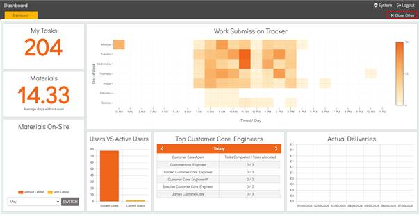
Dashboard My Tasks
The Dashboard My Tasks section provides a summary of the number of outstanding Tasks assigned to the user. This value represents Tasks where the Completed checkbox has not been selected, indicating those that still require attention to be completed.
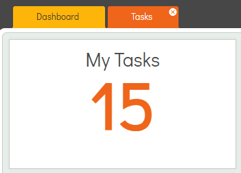
Selecting the My Tasks tile on the Dashboard navigates the user directly to the Tasks area, with the User filter automatically set to their account so they can immediately view Tasks assigned to them that require completion.
Dashboard Materials
The Dashboard Materials section displays a figure, which may include a decimal place, representing the average number of days Materials remain without any work being submitted.
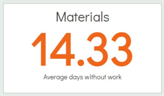
The Materials figure is calculated by identifying Materials that have been Approved & Sent and subsequently Delivered within a Purchase Order,then measuring the number of days since the Actual Delivery Date. When a Work Submission is made against the same Build Stage, the associated number of days is excluded from the calculation.
This calculation is based on all relevant data within the system and is used to determine the overall average number of days Materials remain without work being submitted.
Incomplete Work Submissions are excluded from this calculation, as they are not considered submitted. Only Work Submissions with a status other than Incomplete are included in the figure.
Dashboard Materials On-Site
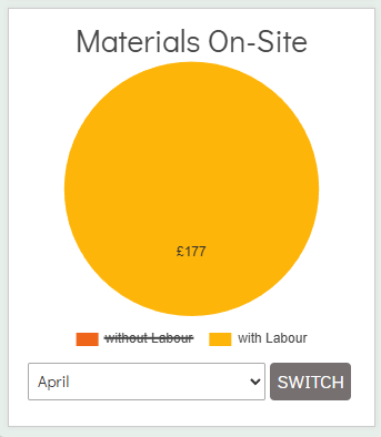
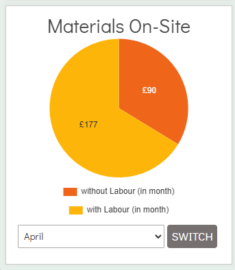
The Dashboard Materials On-Site figures represent the cost of Materials On-Site that have been ordered and have had labour submitted against them compared to those that have been ordered but do not yet have labour submitted.
This is displayed as a pie chart split into two sections, with labour and without labour, each represented by a distinct colour code.
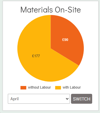
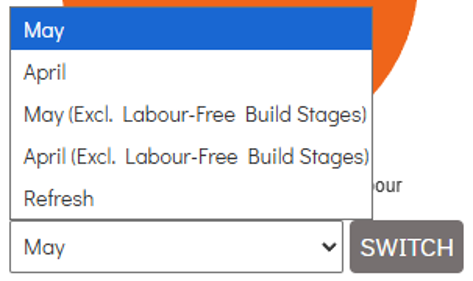
The dropdown contains five options: the current month (selected by default), the previous month, current month (Excl. Labour-Free Build Stages), previous month (Excl. Labour-Free Build Stages), and a Refresh option. This allows the user to switch between the current and previous month views.
The (Excl. Labour-Free Build Stages) options exclude Materials costs that have been ordered for Build Stages where the Build Stage does not contain any Labour Items.
When Refresh is selected, the system reloads the data for the month currently in view, ensuring the chart reflects any updates made since the user has been in the Dashboard.
If no Materials have been ordered within a given month, the pie chart will not be displayed.
The Material cost figures are derived from Purchase Orders that have been both Approved & Sent and subsequently Delivered, using their Actual Delivered Dates as the basis for calculation.
The Materials On-Site with labour figure is calculated by identifying Work Submissions created against the same Plot Build Stage or Variation as the Purchase Order. When a valid Work Submission exists, the Delivered Material costs from the corresponding Purchase Order are marked as with labour for that Plot Build Stage or Variation. Incomplete Work Submissions are excluded from this calculation, as they are not considered submitted, and only Work Submissions with a status other than Incomplete are included.
Application Settings are applied when calculating the values for Materials On-Site. Once a Work Submission has been created for a parent Build Stage, any child Build Stage Material costs are moved into the with labour category and are no longer considered without labour. Existing materials and submissions are updated accordingly if the Application Settings are changed. This calculation only uses the checkboxes from Application Settings and does not use the dropdown selections.
Without labour and with labour can be toggled to be excluded from the pie chart. Selecting either option applies a strikethrough to the label and removes that segment from the chart. Selecting the option again removes the strikethrough and restores the corresponding segment in the pie chart.
Next to the dropdown is a button named Switch, which only becomes selectable when the previous month is selected. When Switch is selected, the chart labels change to without labour (in month) and with labour (in month). The figures are then updated to show Material costs where labour was applied within the selected month, while the alternative view reflects whether labour has been applied to the Material cost in general, regardless of the selected month.
Dashboard Work Submission Tracker
The Dashboard Work Submission Tracker displays a heatmap graph showing the amount of Work Submissions for each day of the current week, with a time range from 12AM to 11PM.
A heat range bar is located on the right-hand side of the Work Submission Tracker, indicating colour intensity based on the number of Work Submissions at each day and time. The scale is calculated starting from zero and increasing up to the maximum number of Work Submissions shown in the graph.
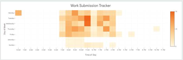
Each cell in the tracker displays a tooltip when the user hovers over it, showing the Day, Time, and number of Submissions.
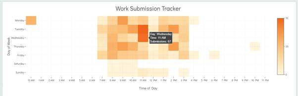
The Work Submissions in the map are positioned according to their Submitted Date and Submitted Time.
Incomplete Work Submissions are excluded from the heat map, as they are not classed as submitted. Only Work Submissions with a status other than Incomplete are included in the heat map. Deleted Work Submissions are also excluded from the heat map.
Dashboard Users VS Active Users
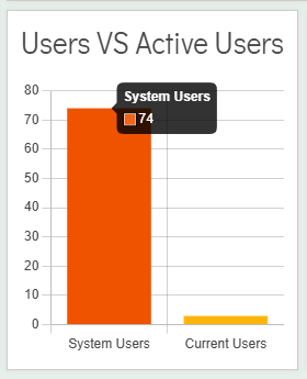
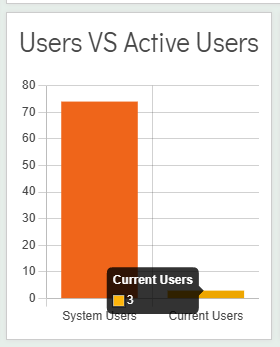
The Users VS Active Users section is displayed as a bar chart and provides an overview of the total valid Users in the system compared with those currently signed in.
The graph is calculated starting from 0, with the maximum value determined by the total number of Users in the system. This value is then rounded up to the nearest ten to set the upper limit of the graph scale.
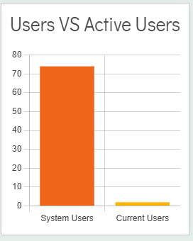
The System Users figure represents the number of non-deleted Users in the system who do not have the Disabled checkbox selected within the Account Information tab.
The Current Users figure represents the number of Users currently logged in to the Admin System and the Operative Portal. If a User closes their browser without logging out, their session will be automatically logged out after 1 hour of inactivity.
When each bar is hovered over, a tooltip is displayed showing the exact figure for either System Users or Current Users.
Dashboard Top Customer Care Engineers
The Dashboard Top Customer Care Engineers section displays the top 5 Customer Care users based on the number of Customer Care jobs allocated to them, ordered in descending order from highest to lowest allocation. It also shows the difference between their allocated jobs and completed jobs.
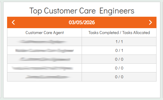
The table is displayed on a date basis, defaulting to the current date. This can be adjusted using the left arrow to move back a day or the right arrow to move forward a day, with the table updating accordingly. The date can also be selected directly to return the view to the current date.
Each Customer Care job in the Top Customer Care Engineers table is positioned based on its Booked Date, which is set in the Customer Care Details page.
The Tasks Completed figure represents the number of Customer Care jobs assigned to the Customer Care Engineer on the selected date that have had the Completed checkbox selected in the Customer Care Details page.
The Tasks Allocated figure represents the number of Customer Care jobs with a Booked Date matching the selected date that are assigned to that Customer Care Engineer.
Deleted Customer Care jobs are excluded from this table as they are not required to be displayed.
Dashboard Actual Deliveries
The Dashboard Actual Deliveries section provides a bar chart view of Actual Deliveries from Purchase Orders over the current date and the previous 6 days, also displaying the associated Material costs for those deliveries.
The cost values alongside the bar chart are calculated starting from £0.00, with the upper limit determined by the highest delivered cost within the range, which is used to set the top of the chart scale.
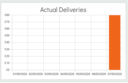
Deliveries are added to the chart when the Delivered checkbox is selected in either the Purchase Order Details or Credit Order Details page and the date they appear under is dependent on their Actual Delivery Date.
The cost can appear as a negative value where more Materials have been marked as Delivered on a Credit Order than on a Purchase Order.
The system also supports marking Purchase Orders and Credit Orders as Partially Delivered. In these cases, the Actual Deliveries chart only includes the cost of items that have been marked as Delivered, rather than the full order value.
Each bar in the chart displays a tooltip when the user hovers over it, showing the date and the cost of Materials Delivered on that date.
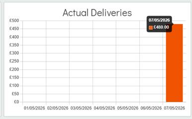
The user can select a bar from the graph, which navigates them to the Purchasing area. The Delivered filter is automatically applied to the selected date, displaying all Deliveries that occurred on that date.